I had the wonderful opportunity to do my job shadow with Anna Ratkoviak, one of the interior designers for Starbucks. In the few hours that I was able to spend touring and observing the interior design department at the headquarters, I feel like I learned several new design process techniques, especially for the inspiration and brainstorming portion. Perhaps the most helpful of these is the use of an inspiration board, which can include such a multitude of images, colors, and objects. I've actually started one of these for one of my other design projects which is centered around designing a residential space.
Prior to this job shadow, I was pretty adamant about my desire to do residential design. Seeing all of the thought and regional personality that Starbucks puts into the designs of their stores, however, makes me start to think twice. While Starbucks is very much a commercial company, the design of their stores is soft commercial at most. They successfully create a third space—something that I think is very important.
I would say that overall, this job shadow will affect my design work because it has provided me with insight to the creative process of design professionals.
October 5, 2013
Frye Art Museum Visit
The entry to the Frye Art Museum begins while still outside, and the sense of being enclosed increases as one ascends the ramp. The small foyer area has several tall windows which allow lots of light into the space, maintaining its connection to the outside. From there, the natural lighting and the connection to the outdoors is dependent on the art exhibit—if it’s too light-sensitive, any source of daylight is blocked off completely.
When I visited the museum, light was allowed to enter the building. This created patches of natural light flooding from the ceiling and highlighting the stark white walls and light hardwood floors. The interior form was very interesting, acting somewhat like a maze as one’s path weaves through rooms. Some pieces blocked off passageways that would otherwise be usable, which was somewhat frustrating to navigate, as there was really one path to take.
Chapel of St Ignatius Visit
The use of natural light in the Chapel of St. Ignatius was very interesting, because aside from the foyer area, windows did not let in a direct stream of light. Rather, the light was reflected and diffused softly throughout the space, sometimes going through colored glass to create patches of colorful light on the walls. The walls had a very distinct textural pattern to them without being rigid. The minor breaks in pattern are crucial to making the space feel personal, rather than manufactured. This personal feeling brings a stronger sense of community and human connection, two very important things for a church.
New Horizons and Street Bean Visit
Visiting the New Horizons shelter really made me consider organization in a more in-depth manner. While there are designated areas where certain activities take place, there is no definition of space. Of course, for the purpose of the building, an open layout is more practical. In residential terms, however, I feel that some sort of structure is needed, whether it’s with full or partial walls, or placement of furniture.
For this space, I think that it is important to consider the environment that teens face when they aren't at the shelter. By then determining positive qualities that these circumstances lack, a space can be designed which creates a retreat for the teens who visit New Horizons. Throughout the tour, I noticed that while it is intended to be an inviting space, the lighting does not aid this aesthetic at all. In some areas where lights should illuminate the entire space (namely the office cubicle portion), it was far too dark. In the area open to the teens, the lights were very harsh and cold, which is not comforting at all.
My personal recommendation for upgrading the area that the teens use would be to more strongly create the sense of distinct areas by using different types of lighting for the different areas. This would maintain the open floor plan which is necessary for the function of the space while forming a feeling of a more comforting and homey space.
For this space, I think that it is important to consider the environment that teens face when they aren't at the shelter. By then determining positive qualities that these circumstances lack, a space can be designed which creates a retreat for the teens who visit New Horizons. Throughout the tour, I noticed that while it is intended to be an inviting space, the lighting does not aid this aesthetic at all. In some areas where lights should illuminate the entire space (namely the office cubicle portion), it was far too dark. In the area open to the teens, the lights were very harsh and cold, which is not comforting at all.
My personal recommendation for upgrading the area that the teens use would be to more strongly create the sense of distinct areas by using different types of lighting for the different areas. This would maintain the open floor plan which is necessary for the function of the space while forming a feeling of a more comforting and homey space.
325 Westlake Residence Tour
The 325 Westlake construction site was especially of interest to me because the first floor will act as a facility for Mad Art which works with emerging artists. I also really liked that for that first floor, original masonry will be left exposed. I personally enjoy the aesthetic of exposed brick, and I’d imagine that it also helps cut costs. I would say that the most important idea of this project is working with what is available. For 325 Westlake, though, this isn't so much an idea as a necessity. In some apartments, for example, one of the tower’s support beams cuts through the exact spot where a kitchen counter needed to go. This problem had been solved, which shows that even if the problem itself can’t be fixed or altered, there is always a creative solution to work around it.
zHome Tour
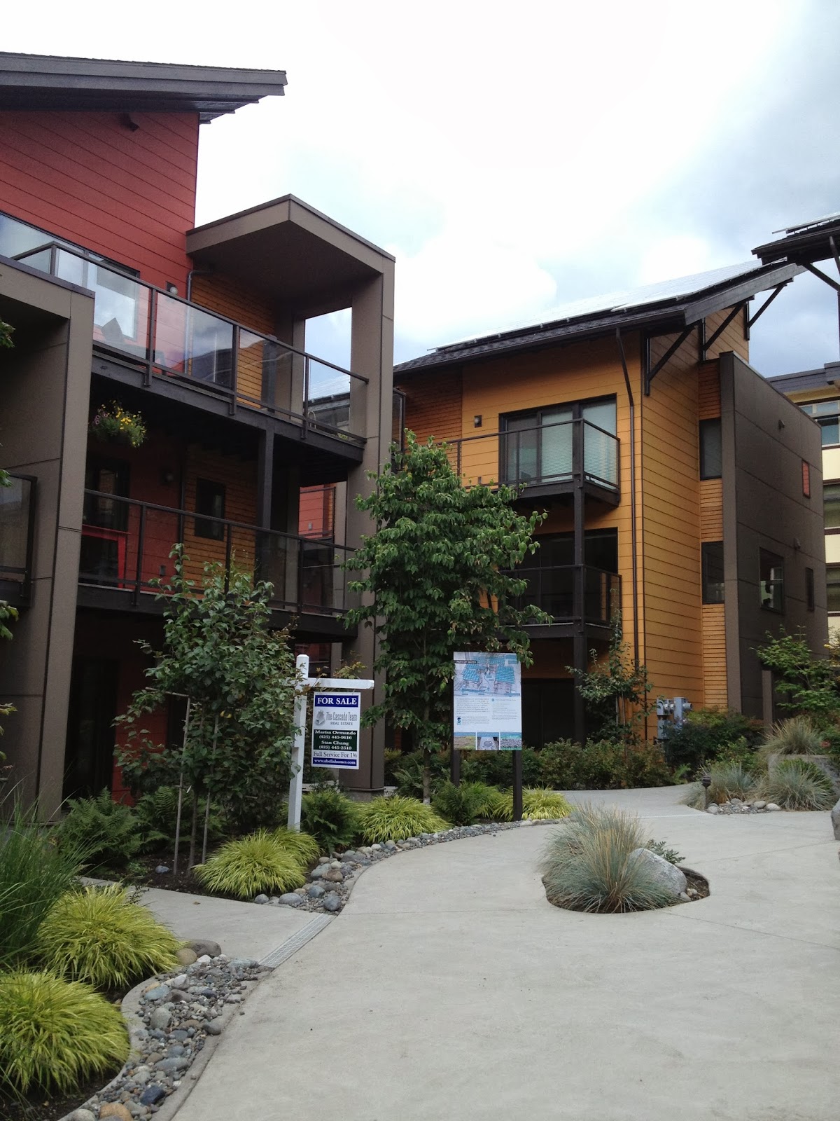
Our visit to the zHome provided lots of insight about various green options for residences. I gained many important ideas from this experience, such as the concept of circulating the air and heating or cooling the home in a more efficient manner by allowing the warm air already in the structure to mingle with the colder outside air being brought in. I was also very impressed with the garage setup, and the reasoning behind it. By moving the garages and other parking to the back of the complexes, the cluster of apartments is able to remain “green-centric” as opposed to having a barren parking lot between buildings like most apartments. Having the garages and parking located somewhere other than between all of the buildings also allows for a smaller space footprint, as there is no need for space to maneuver and park cars. Perhaps most importantly, though, the zHome tour really demonstrated that affordable housing doesn't have to look like small, run-down apartments.
September 23, 2013
Ride, Don't Walk
The Ride, Don't Walk activity provided me with a lot of insight as to what it's like to use a wheelchair, and the problems that come with it. Throughout the exercise, I continuously found myself grazing my knuckles on walls and getting a little too close to corners while turning around them. Bathrooms in Carpenter Hall, though they have a wheelchair stall, are very difficult to maneuver in, especially with other people present. I also noticed that the roll-under counter was a bit low for my legs, and that I would have to turn sideways for washing my hands in order to avoid scraping my knees on the underside of the counter.
Prior to this activity, I thought that the ADA code for ramps (1" rise for 12" of length) seemed fairly flat. While participating in it though, I could see why that was the maximum slope, as it was a bit challenging. While on the ground floor of Daggy, I quickly realized how dangerous it would be for someone in a wheelchair, as the ramp is about 6" of rise for every 12 inches of run (I rolled down it and ran into a wall).
I cannot say that I now fully understand what it is like to be in a wheelchair, especially within the relatively short period of time that I used one. However, I am now much more conscious of problematic designs, and the challenges that they may present to those who use wheelchairs. I would say that this activity was very beneficial to me as a beginning designer, and that it will have a lasting influence on my design choices.
Prior to this activity, I thought that the ADA code for ramps (1" rise for 12" of length) seemed fairly flat. While participating in it though, I could see why that was the maximum slope, as it was a bit challenging. While on the ground floor of Daggy, I quickly realized how dangerous it would be for someone in a wheelchair, as the ramp is about 6" of rise for every 12 inches of run (I rolled down it and ran into a wall).
I cannot say that I now fully understand what it is like to be in a wheelchair, especially within the relatively short period of time that I used one. However, I am now much more conscious of problematic designs, and the challenges that they may present to those who use wheelchairs. I would say that this activity was very beneficial to me as a beginning designer, and that it will have a lasting influence on my design choices.
Subscribe to:
Posts (Atom)