February 9, 2015

Case Studies


The goal of these case studies was to examine offices in Tokyo, Japan. I chose two very different building types, and found them both to be incredibly interesting. In both instances, there is a push to incorporate natural daylight when possible, which positively contributes to health of the users. It was interesting to see these different approaches, and I think that the emphasis on biophilia found in the Sugamo Shinkin Bank is going to be especially important to try to incorporate into my future project, which is in a skyscraper.

April 16, 2014

STIR Competition Entry

The project that I used for the Sherwin-Williams STIR competition was that which was an adaptive reuse design for the Northern Pacific Railway Depot in Pullman, Washington. This project consists of designing the existing depot to function as a residence, a studio, and an art gallery. The hypothetical client for this project is a watercolor and tempera artist with a legally blind spouse. In order to gain a thorough understanding of what a watercolor and tempera artist needs from their studio, I consulted with Spokane artist Stan Miller, whose work served as inspiration for my color palette. Due to the lighter and more transparent nature of watercolor, I was able to rationalize the use of darker colors throughout the gallery.


This portion of the project and the competition requirements for a minimum of three colors really pushed me to step out of my comfort zone regarding color application, especially in a gallery space. Since striving to choose more vibrant colors, I've found myself more readily applying them in other areas of my design, namely the residence.

March 3, 2014

Concept Development

The project that I am currently working on is an adaptive reuse design for the Northern Pacific Railroad Depot in Pullman, Washington. During my site visit, I continuously found myself being drawn to this bench, located near the southeast end of the depot. 

I was struck by the contrasting nature of the bench and its surroundings, and the interaction of those contrasting elements. The arms and sides of the bench are composed primarily of curving organic shapes, while the brick wall behind it displays strict geometry, creating a conflict between their lines. Furthermore, I really liked the contrast in the nature of these two objects: the bench provides a resting space while the train depot is a chaotic traveling hub.  

The contrasting line types and the idea of pausing were both translated into a two-dimensional parti. It incorporates the bold, horizontal lines of the brick wall's mortar, the organic curves of the bench, and the feeling of an exhale, which is communicated through the curved shape and the use of airy and relaxing blues.
This parti design was then transformed into a textile pattern. Again, the horizontal lines are a prominent feature, and are intersected by organic forms. The field color is a pale, relaxing blue, while the organic shapes are earthier red and brown tones. 
Finally, my inspiration took on a three-dimensional form through the use of basswood, 16g wire, and bristol board. This model explores the interaction between the organic and geometric shapes, as the wire weaves in and out and around the basswood. The element of contrast was brought into the model through the materiality, as the man-made wire forms the organic shapes and the basswood signifies the geometric lines. 

February 3, 2014

Habitat For Humanity

In this project, I worked with a team of two others to design a home in the Tiempo Commons neighborhood of Moscow, ID for the Palouse Habitat for Humanity. We were challenged to create a two story house with about 640 square feet on each floor--a tight space for the expected 4 bedrooms. Another expectation of this project was that the final design would fit in with the common aesthetics of the houses in the area.
This project required several reworkings of our floor plans and elevation due to space constraints. I myself worked very hard on this project and did most of the work, particularly that involving the final floor plans and elevation.
The project served as a wonderful opportunity to learn just what can be done in a week, as well as what can be done with spaces as small as this. In working with Habitat for Humanity, I also learned about what makes a house cost-effective, including using modules of 2', 4', and 8', as well as stacking bathrooms and sharing water walls to reduce piping used.

December 6, 2013

Graphic Reflection: A Semester of Growth


Throughout the course of Interior Design 205, perspective drawings played a major role. Although I started with a strong knowledge of how perspectives worked and how to draw them, my understanding was on a more artistic level, in which more guesswork was involved. With the first project, I was introduced to the idea of creating a grid to build a more accurate perspective drawing. Fortunately, my existing knowledge of perspectives assisted me while learning this new technique.
Since the first project, I have become more familiar with the process of making a perspective grid, and as a result, can draw one more accurately and within a shorter amount of time. My ability to do this quickly has definitely been a strength of mine throughout the class, as it leaves me with more time to focus on the quality of the drawing itself.
In this course, I have also learned how to render drawings. My artistic background was once again proven helpful, as I was able to identify how and where colors needed to be applied to achieve the desired effect. Working with the Chartpak markers, however, was completely new and a bit of a challenge, and I still struggle with some effects of the markers, such as bleeding edges.
My sketching abilities have also improved over this semester. I am able to draw a free-handed straight line with ease, and have developed a quick, loose style for field sketching. One difficulty that I encountered frequently was my tendency to shade in my dark values right away, as opposed to building them as I worked.
Overall, I would say that this semester, I learned a lot about my own style and abilities in visual expression—whether it’s a simple couch or an in-depth perspective of a room.  Perhaps even more importantly, I have developed techniques that will carry me through this major and this field. 

October 25, 2013

Habitat For Humanity

On September 9th, myself and a handful of classmates spent the day volunteering for Habitat for Humanity at the Albion site. At the time of our visit, only the foundation had been constructed, and that had been done only a few days prior. Our day at the site was spent putting in drain tile. This involved moving a LOT of gravel. (Several tons, in fact.) Throughout the course of the day, most of my time was spent in the ditch surrounding the foundation directing gravel pouring and evening it out. 

The physical labor was actually somewhat enjoyable for me, as I hadn't done any "heavy lifting" so to speak since my summer job. While the progress that we made wasn't so readily evident like putting framing up would be, we certainly accomplished a lot throughout the day. 

When I was much younger, a housing development was constructed up the hill from my neighborhood. Since it was so close, my dad would often take me up to see the houses being built. Usually when we went, the framing had already been put up, so I had never really seen what really goes into a foundation. It was really interesting to be able to see and participate in the construction of a house before the walls go up.

Overall, this project was both enjoyable and rewarding, and it has made me consider volunteering for Spokane's Habitat for Humanity over the coming summer.

October 5, 2013

Sketch Crawl at the Armory

My sketches done during the Saturday morning sketch crawl exhibit a strong capability for loose, free-handed rendering of plants. Unfortunately, they do not have color in them, as I only had watercolors with them, and watercolors cause the Flair pen to bleed. For other field sketches such as this, I would be sure to bring my colored pencils or basic rendering markers for color application. I think that my first sketch is much better than the second one, and a lot of this has to do with spending more time on the first. I was also drawing from a very difficult angle in the second sketch, especially for the subject matter—the Space Needle at Seattle Center.

Starbucks Job Shadow

I had the wonderful opportunity to do my job shadow with Anna Ratkoviak, one of the interior designers for Starbucks. In the few hours that I was able to spend touring and observing the interior design department at the headquarters, I feel like I learned several new design process techniques, especially for the inspiration and brainstorming portion. Perhaps the most helpful of these is the use of an inspiration board, which can include such a multitude of images, colors, and objects. I've actually started one of these for one of my other design projects which is centered around designing a residential space.
Prior to this job shadow, I was pretty adamant about my desire to do residential design. Seeing all of the thought and regional personality that Starbucks puts into the designs of their stores, however, makes me start to think twice. While Starbucks is very much a commercial company, the design of their stores is soft commercial at most. They successfully create a third space—something that I think is very important.
I would say that overall, this job shadow will affect my design work because it has provided me with insight to the creative process of design professionals.

Frye Art Museum Visit

The entry to the Frye Art Museum begins while still outside, and the sense of being enclosed increases as one ascends the ramp. The small foyer area has several tall windows which allow lots of light into the space, maintaining its connection to the outside. From there, the natural lighting and the connection to the outdoors is dependent on the art exhibit—if it’s too light-sensitive, any source of daylight is blocked off completely.
When I visited the museum, light was allowed to enter the building. This created patches of natural light flooding from the ceiling and highlighting the stark white walls and light hardwood floors. The interior form was very interesting, acting somewhat like a maze as one’s path weaves through rooms. Some pieces blocked off passageways that would otherwise be usable, which was somewhat frustrating to navigate, as there was really one path to take.

Chapel of St Ignatius Visit

The use of natural light in the Chapel of St. Ignatius was very interesting, because aside from the foyer area, windows did not let in a direct stream of light. Rather, the light was reflected and diffused softly throughout the space, sometimes going through colored glass to create patches of colorful light on the walls. The walls had a very distinct textural pattern to them without being rigid. The minor breaks in pattern are crucial to making the space feel personal, rather than manufactured. This personal feeling brings a stronger sense of community and human connection, two very important things for a church.


New Horizons and Street Bean Visit

Visiting the New Horizons shelter really made me consider organization in a more in-depth manner. While there are designated areas where certain activities take place, there is no definition of space. Of course, for the purpose of the building, an open layout is more practical. In residential terms, however, I feel that some sort of structure is needed, whether it’s with full or partial walls, or placement of furniture.
For this space, I think that it is important to consider the environment that teens face when they aren't at the shelter. By then determining positive qualities that these circumstances lack, a space can be designed which creates a retreat for the teens who visit New Horizons. Throughout the tour, I noticed that while it is intended to be an inviting space, the lighting does not aid this aesthetic at all. In some areas where lights should illuminate the entire space (namely the office cubicle portion), it was far too dark. In the area open to the teens, the lights were very harsh and cold, which is not comforting at all.
My personal recommendation for upgrading the area that the teens use would be to more strongly create the sense of distinct areas by using different types of lighting for the different areas. This would maintain the open floor plan which is necessary for the function of the space while forming a feeling of a more comforting and homey space.

325 Westlake Residence Tour

The 325 Westlake construction site was especially of interest to me because the first floor will act as a facility for Mad Art which works with emerging artists. I also really liked that for that first floor, original masonry will be left exposed. I personally enjoy the aesthetic of exposed brick, and I’d imagine that it also helps cut costs. I would say that the most important idea of this project is working with what is available. For 325 Westlake, though, this isn't so much an idea as a necessity. In some apartments, for example, one of the tower’s support beams cuts through the exact spot where a kitchen counter needed to go. This problem had been solved, which shows that even if the problem itself can’t be fixed or altered, there is always a creative solution to work around it.


zHome Tour

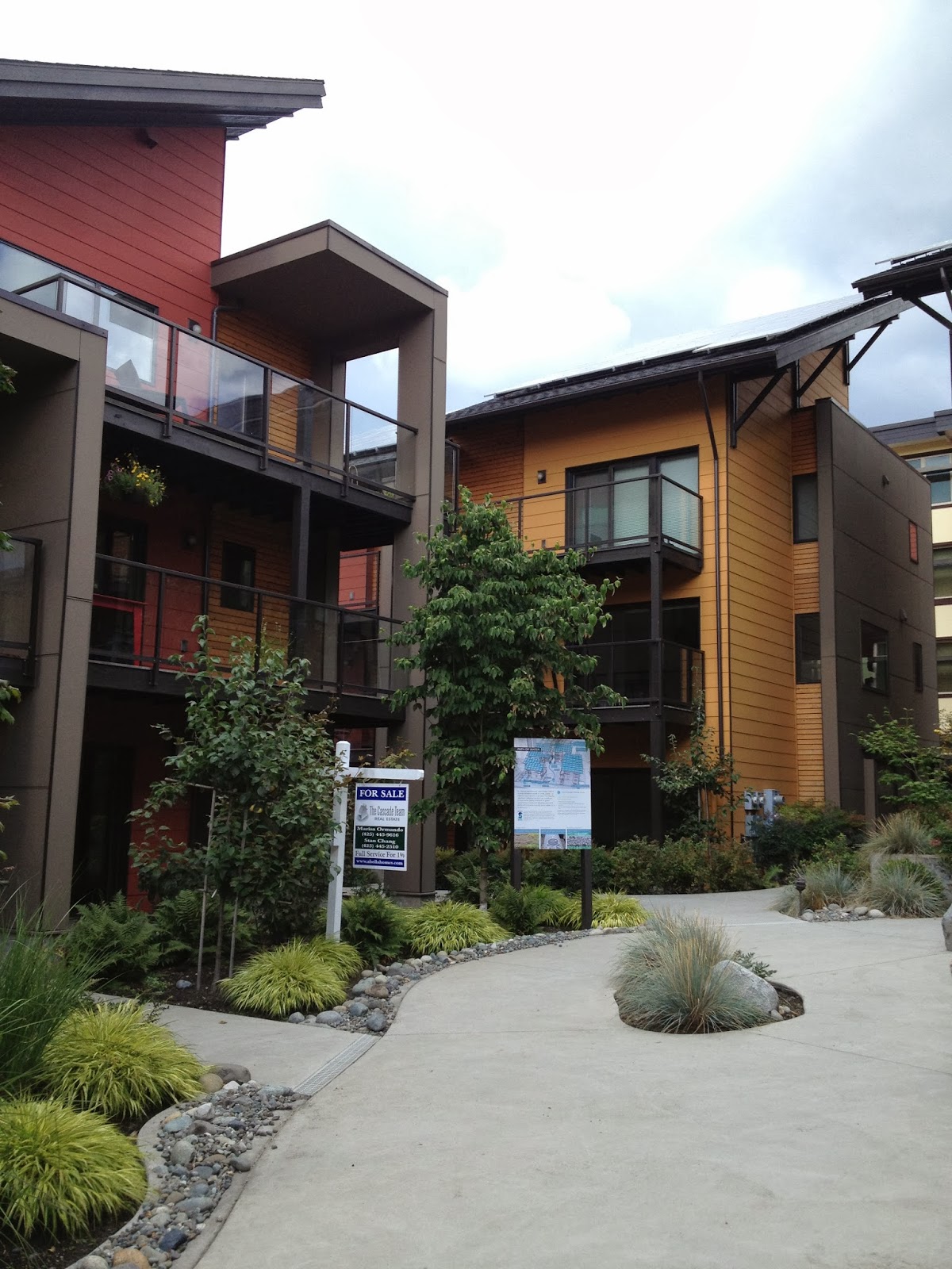
Our visit to the zHome provided lots of insight about various green options for residences. I gained many important ideas from this experience, such as the concept of circulating the air and heating or cooling the home in a more efficient manner by allowing the warm air already in the structure to mingle with the colder outside air being brought in. I was also very impressed with the garage setup, and the reasoning behind it. By moving the garages and other parking to the back of the complexes, the cluster of apartments is able to remain “green-centric” as opposed to having a barren parking lot between buildings like most apartments. Having the garages and parking located somewhere other than between all of the buildings also allows for a smaller space footprint, as there is no need for space to maneuver and park cars. Perhaps most importantly, though, the zHome tour really demonstrated that affordable housing doesn't have to look like small, run-down apartments.

September 23, 2013

Ride, Don't Walk

The Ride, Don't Walk activity provided me with a lot of insight as to what it's like to use a wheelchair, and the problems that come with it. Throughout the exercise, I continuously found myself grazing my knuckles on walls and getting a little too close to corners while turning around them. Bathrooms in Carpenter Hall, though they have a wheelchair stall, are very difficult to maneuver in, especially with other people present. I also noticed that the roll-under counter was a bit low for my legs, and that I would have to turn sideways for washing my hands in order to avoid scraping my knees on the underside of the counter.
Prior to this activity, I thought that the ADA code for ramps (1" rise for 12" of length) seemed fairly flat. While participating in it though, I could see why that was the maximum slope, as it was a bit challenging. While on the ground floor of Daggy, I quickly realized how dangerous it would be for someone in a wheelchair, as the ramp is about 6" of rise for every 12 inches of run (I rolled down it and ran into a wall).

I cannot say that I now fully understand what it is like to be in a wheelchair, especially within the relatively short period of time that I used one. However, I am now much more conscious of problematic designs, and the challenges that they may present to those who use wheelchairs. I would say that this activity was very beneficial to me as a beginning designer, and that it will have a lasting influence on my design choices.

August 26, 2013

The Personal Sense of "Home"

Ideally, home is a place of relaxation, comfort, and self expression. For some, this is signified by a building or a place or a specific memory. Upon reflecting where my home is, I realized that I consider many places my home. The clearest connection between all of them is that they are all spaces that I share with my extended family on my dad's side. Growing up, my house served as the hub for family gatherings, and year after year, Christmas and Easter celebrations would be held in our living room. These family get-togethers are the root of some of my favorite memories in the house.

While it might be logical that the house I grew up in (and the house that my dad and his siblings grew up in) would be what I most strongly associate with home, it's not. What I most frequently think of when I imagine home is the family lake cabin on Deer Lake, which is shared between my grandpa, my family, and my dad's siblings and their families. It's here at the lake that I first experienced the freedom to spend my time as I pleased. It's where I learned how to waterski, where I caught my first fish, and where I got countless splinters on our old wooden dock as a small child. More recently, it's where my dad taught me to drive the boat, and it was where I spent most of my free time this last summer.
Most importantly, though, our lake cabin has always been a place where I get to be with my family, who truly make it home.

Above is a selection from in-class sketches which depict my home. On the left is my house in Spokane, and on the right is my family's lake cabin at Deer Lake. Below is a photo of our lake cabin, taken from the end of the dock.


August 8, 2013

Summertime Internship

Yes, I managed to find a paid internship for the summer! For three months, I worked  for Paint In My Hair Boutique in Spokane, WA as their summertime painting intern. I learned an immense amount in my short time there, from using Annie Sloan Chalk Paint (and the sprayer to apply it) to making furniture repairs. More often than not, I came home with paint on my clothes, on my arms and legs, and yes, even in my hair. Luckily, I don't mind getting messy, especially if I'm doing work I enjoy and am able to apply my creative skills.

I worked on many projects that have required lots of problem solving. I've built corner shelving units using bi-fold doors and pre-cut corner shelves, arranged little vignettes on the sales floor, and have had to find the best way to clean up dull, dirty, old brass knobs and pulls from drawers and cabinets.


In the far right photo (taken from the store's Facebook page), you can see the shelves from the far left photo. 

My favorite project, however, is probably a table and chair set that I did completely on my own without guidance for color or finish. Below are the before and after photos.


April 30, 2013

SKETCH NOTE MASTER POST


These four pages of sketch notes are some of my favorites from this semester. I find that the sketches are helpful and communicate the information in a fun, artistic way. Text is organized successfully, and the columns are clearly divided. While going through my sketch notes from the past semester, these four really stood out to me.

LETTERING MASTER POST


This post is an accumulation of the various lettering pieces I have done throughout the semester. Since beginning the lettering practices, I have noticed that my handwriting on blank paper has greatly improved, and that I write in much straighter lines. Throughout these eight assignments, I have developed a style that I find very readable. There is definitely room for improvement in the uniformity of my letters, but overall, I would find this project to be a success.


April 25, 2013

SKETCH MASTERPOST


SKETCH 1
This is a sketch containing the outlines of 5 people, done to practice the figures that would be put into technical drawings for showing scale. I rather dislike contour drawings, but didn't find this particular sketch to be too unbearable. If I were to do this project again, I would do these drawings in ink as opposed to pencil.


SKETCH 3
This sketch is a tessellation which combines the shapes of snake scales, pine cones, and honeycomb. I like the way that the shapes transition into one another, which was made possible by the shapes I chose. Were I to recreate the sketch, I think I would like to employ color or shading to add dimension and interest.


SKETCH 4
The purpose for this sketch was to practice shading techniques, specifically crosshatching. I've never been a fan of using crosshatching as a shading technique because I prefer to have well-blended shadows because they produce a more realistic look. I think that I would play with lighting if I were to attempt this sketch again, or possibly do it in ink, which would make crosshatching a more logical technique.


SKETCH 5
This sketch relies on negative space to create the chair's shape. I found this sketch rather enjoyable to create because it challenged me to look at the subject differently and really consider the manner in which it occupied its space. If I did this sketch again, I would probably use darker shading and harder edges to make the chair's outline more definite.


SKETCH 6
Doing this sketch was interesting, because it made me really think about the form of the chair and recognize the design that went into it. Were I to do this study again, I would not use such a loose technique to execute the drawings, but rather employ more solid lines, especially for the contour outlines.


TREE SKETCH
The point of this sketch was to practice my technique for drawing trees. The two trees in the upper-right side are trees I have practiced many times before, and the tree closest to the middle is very similar to them. I've never drawn trees very well, and when I found this technique, I was very pleased. I was very surprised with how the other trees turned out, because I haven't drawn them before. I like the abstract feel which is especially prominent in the tree in the lower-right portion of the page. If I did this sketch again, I would definitely practice drawing the bare tree (lower-left) some more.


SKETCH 9
This sketch is a one-point perspective my living room at home. In the sketch, I experimented with using the light source from the large windows to create strong contrast in the lower drawing. I struggled a bit with the proportions of the room, and next time I would definitely work from a photograph instead of my memory.


SKETCH 10
For this sketch, I used colored pencils on black paper to draw a latch on a box that I have. I think it turned out fairly realistically, which I was very happy about. I really like the colors which I chose, because I think they really help create a 3D look. One thing I would like to improve about this sketch, however, are the screws. I feel as if the detail could have been executed a little more accurately, especially with a sharper pencil. Other than that, I don't believe I would change anything else if I did this sketch again.